Chapter 8 Bar Graphs vs. Histograms
Drawing Bar Graphs and Histograms in R
One way to explore data in R is by creating quick vizualizations. We’ll use survey1, the STAT 100 and 200 combined survey data from before, to demonstrate. The dataset has 1628 observations of 24 variables, and a description of the variables in the dataset is available here.
survey1
| gender | genderID | height | weight | shoeSize | schoolYear | studyHr | GPA | ACT | pets | siblings | speed | cash | sleep | shoeNums | ageMother | ageFather | random | love | charity | movie | favTV1 | favTV2 | section |
|---|---|---|---|---|---|---|---|---|---|---|---|---|---|---|---|---|---|---|---|---|---|---|---|
| Male | Male | 66 | 200 | 10.5 | Sophomore | 2.5 | 3.5 | 24 | 1 | 2 | 25 | 5 | 7.0 | 3 | 47 | 49 | 6 | few | 60 | Life is Beautiful | Narcos | Daredevil | Stat100_L1 |
| Female | Female | 66 | 142 | 7.5 | Freshman | 3.0 | 3.8 | 26 | 1 | 1 | 80 | 11 | 4.5 | 21 | 37 | 47 | 4 | few | 60 | The Giant | Como dice el dicho | Drake and Josh | Stat100_L1 |
| Male | Male | 65 | 160 | 10.5 | Freshman | 3.0 | 3.9 | 33 | 6 | 0 | 0 | 45 | 7.5 | 4 | 43 | 46 | 8 | few | 10 | Interstellar | none | none | Stat100_L1 |
| Female | Female | 68 | 118 | 7.5 | Sophomore | 3.0 | 3.9 | 28 | 0 | 1 | 105 | 9 | 7.5 | 25 | 54 | 53 | 8 | few | 25 | La La Land | Friends | Parks and Recreation | Stat100_L1 |
| Female | Female | 61 | 173 | 9.0 | Sophomore | 0.5 | 2.8 | 21 | 1 | 3 | 90 | 7 | 8.0 | 13 | 35 | 60 | 7 | one | 0 | Get Out | Attack on Titan | Rick and Morty | Stat100_L1 |
| Female | Female | 66 | 125 | 8.0 | Sophomore | 2.5 | 2.3 | 20 | 0 | 0 | 50 | 3 | 6.0 | 20 | 40 | 41 | 3 | dozens | 50 | Hidden Figures | The Cosby Show | A Different World | Stat100_L1 |
Let’s explore the height variable a little bit. One way that we can do it is by breaking up, or binning, the data into different groups, then plotting what percentage of the data is in each group. This creates what’s called a histogram. To make a histogram in R, we can use the hist() function (see ?hist for more information). All that hist() needs is an argument x, which is what you’d like to make a histogram of. Since we want the densities, we’ll add in the freq = FALSE argument. This results with a histogram that looks like this:
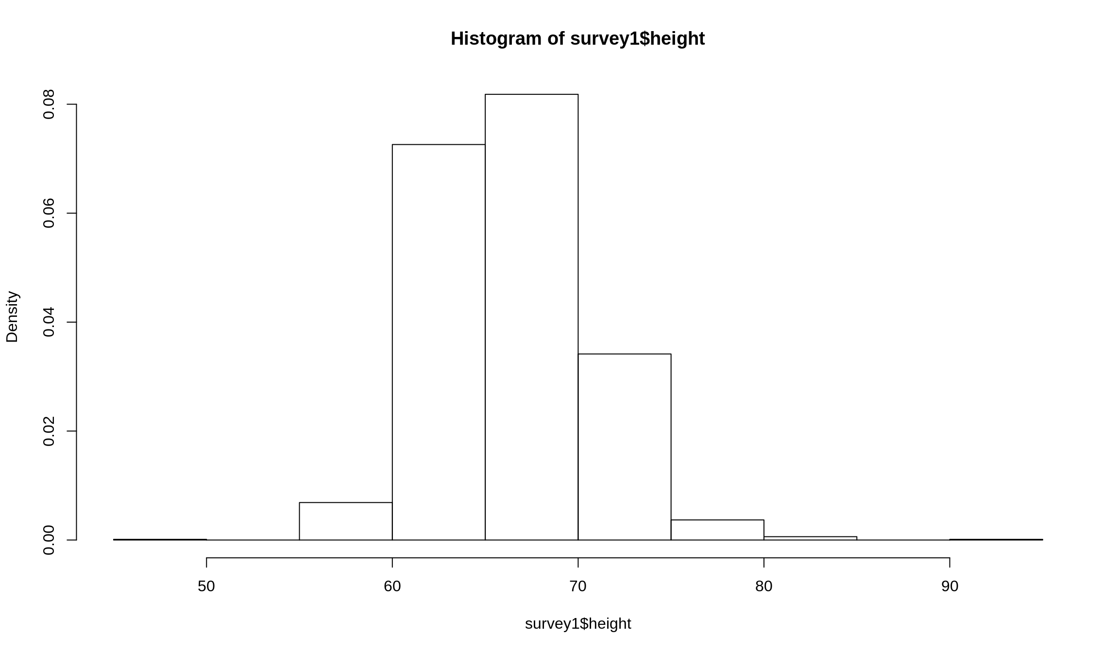
Figure 8.1: A basic histogram
Let’s add a few extra arguments to make the plot a little clearer:
mainandxlabcreate a title and an \(x\)-axis label respectivelyylimsets the range of \(y\)-values that are shown on the \(y\)-axis (Note:xlimdoes the same for the \(x\)-axis)breakscontrols what numbers are used as part of the binning process. The first number is the smallest value in the data, and the last value is the largest. You can find these by employingmin()andmax()individually, or you can use therange()function and get both at the same time. Note: the break points we used were arbitrarily selectedcolchanges the colors of the bars. We change these to make them a little easier to identify, but it’s purely cosmetic. Supplying a single value, which can be any named color thatRalready recognizes, an RGB value while using thergb()function, or a hexadecimal color value supplied as acharacter, preceded by a#. We’ll leave it to you to learn about these color formats on your own, but kow that they’re available to you. Supplying a single value will change the color for each bar, making all the bars the same color, while supplying a vecotr of the same length as the number of bars will change each color individually
par(mfrow = c(1, 2)) # Puts plots side-by-side

# Histogram
hist(
  survey1$height,
  main = 'Histogram of Heights',
  xlab = 'Heights in Inches',
  ylim = c(0, .1),
  freq = FALSE,
  breaks = c(49, 62, 65, 68, 70, 73, 95),
  axes = FALSE, # Removes default axis numbers
  labels = TRUE, # Put decimals above each bar
  col = '#0088ce',
  border = '#939598'
)
axis(2) # Puts y-axis numbers back
axis(1, at = c(49, 62, 65, 68, 70, 73, 95)) # Puts x-axis numbers back

# Bar plot
hist(
  survey1$height,
  main = 'Bar Plot of Heights',
  xlab = 'Heights in Inches',
  ylim = c(0, 500),
  freq = TRUE,
  breaks = c(49, 62, 65, 68, 70, 73, 95),
  labels = TRUE, # Put counts above each bar
  axes = FALSE, # Removes default axis numbers
  col = '#0088ce',
  border = '#939598'
)
axis(2) # Puts y-axis numbers back
axis(1, at = c(49, 62, 65, 68, 70, 73, 95)) # Puts x-axis numbers back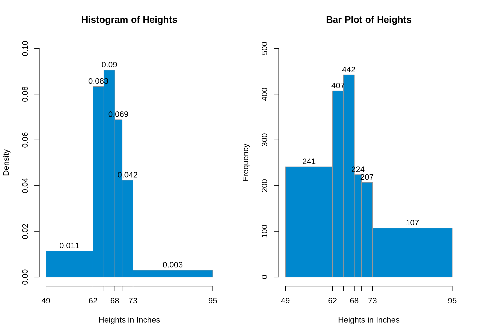
Figure 8.2: Well-formatted histogram (left) and density plot (right)
While the overall shapes of the two plots seem the same, there are a few important differences to take note of. The biggest one is the significance of each block’s width and height. With a histogram, the height shows the percentage per unit inside of each block, while on a bar graph the heights have no meaning whatsoever. The numbers displayed on top show the total number of people inside each interval. The widths (and the \(x\)-axis altogether) of each plot also carry different meanings: barplots just show an interval, while a histogram represents unique heights. That is, even if a number doesn’t appear on the \(x\)-axis in a histogram, that height is still represented. Since the heights and widths of each kind of plot differ, so too do the areas, since the areas are the width of the interval times the height of the interval. Histogram areas show percentages within each block, while bar plot areas are – you guessed it – irrelevant.
We could also summarize our data as the following table:
| Range | Area | Count |
|---|---|---|
| 49-62 | 14.8% | 241 |
| 62-65 | 25% | 407 |
| 65-68 | 27.15% | 442 |
| 68-70 | 13.76% | 224 |
| 70-73 | 12.71% | 207 |
| 73-95 | 6.57% | 107 |
Note: the areas of the blocks on the histogram sum to 100%
This isn’t to say that bar plots don’t have their place, this just isn’t it. Sorry bar graphs, you’ll just have to wait until it’s analysis time. We’ll focus on histograms for the rest of this chapter.
Extracting Information From Histograms
In addition to being able to do visual analysis of a histogram, it may be more useful to use some of the information that the hist() function generates. Usually what we care about is the plot itself, but hist() calculates and stores a lot of information in addition to generating the plot. We’ll store the results from histogram as something called hist1.
hist1 = hist(
  survey1$height,
  main = 'Histogram of Heights',
  xlab = 'Heights in Inches',
  ylim = c(0, .1),
  freq = FALSE,
  breaks = c(49, 62, 65, 68, 70, 73, 95),
  axes = FALSE, # Removes default axis numbers
  labels = TRUE, # Put decimals above each bar
  col = '#0088ce',
  border = '#939598'
)
In addition to the plot, hist1 contains a list with elements breaks, counts, density, mids, xname, and equidist. Check the help file for what these mean, but we should note that the total count of observations and the density of observations in a given range can be accessed by hist1$counts and hist1$density respectively. Check out the use of list element extraction using $ here! These are vectors, and you can use the components as you need to.